MiraKare: one calm dashboard for families sharing care
A one-week design sprint to rethink how family members and caregivers see a loved one’s health, medications and daily tasks, and how they stay in sync with each other.
Caring for a parent, partner or child is rarely one person’s job. Siblings, partners and professional caregivers all hold a piece of the picture: how they slept, which meds were taken, what the blood pressure looked like this morning.
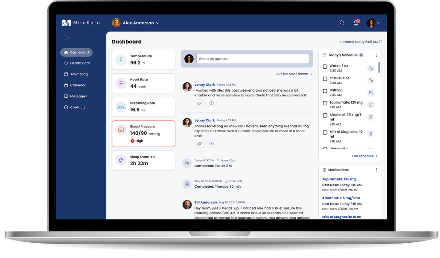
MiraKare’s dashboard was meant to be that shared picture, but caregivers had to work too hard to read it. Our goal in this sprint was to help them understand the care recipient’s status in seconds and act with confidence.
Challenge 1
One picture you can trust
Caregivers need reliable health data and daily care information in one place to make everyday decisions.
Challenge 2
Smoother handoffs
Several people document observations and assessments. They need an easy way to share them and coordinate.
Challenge 3
Nothing slips through
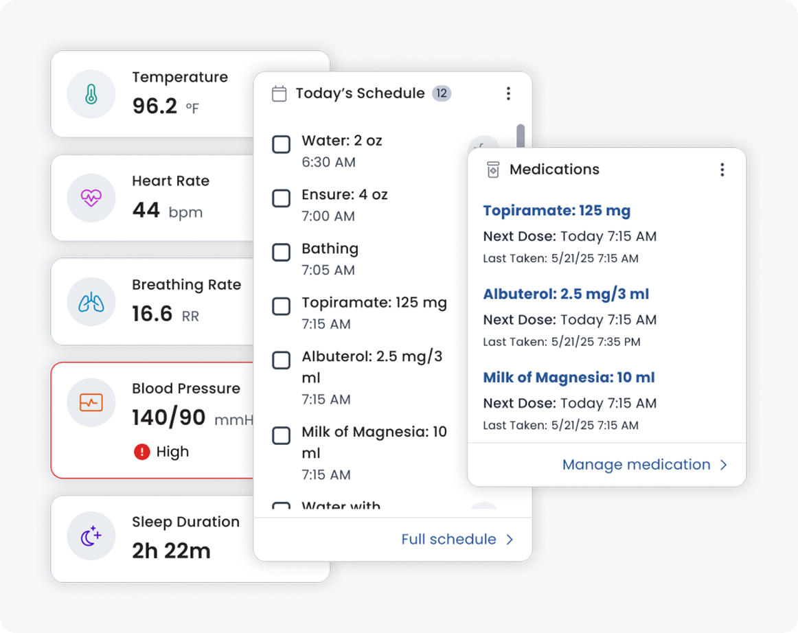
Medications, schedules and vitals have to be tracked, with a clear signal when something needs attention.
02 · Research
What we needed to understand first
Where the existing dashboard creates friction or confusion
What comparable care and health-tracking products treat as table stakes
Which information caregivers need first, and what can wait
With only a week, we focused on evidence we could gather fast: auditing the current platform against the business goals and benchmarking it against competitors.
03 · Key decisions
What we designed, and why
Decision 01
Group by what caregivers check first
What we found
Health metrics, tasks and medications were competing for attention, so caregivers had to scan the whole screen to answer a simple question: is everything okay today?
What we designed
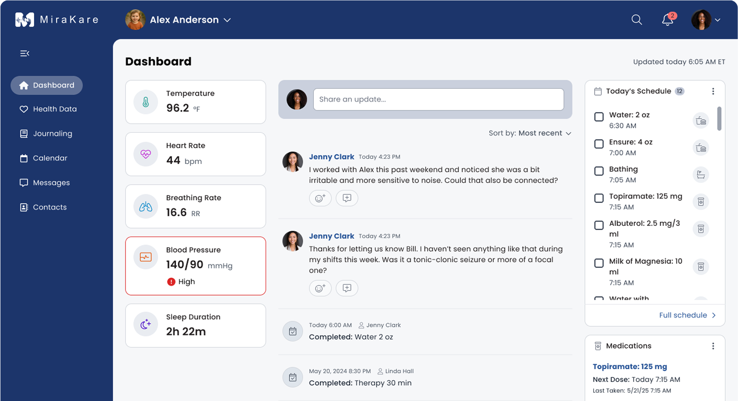
A dashboard organized into clear modules for vitals, today’s schedule, medications and activities. Each answers one question, which lowers cognitive load and speeds up decisions.
Decision 02
One shared feed for the whole care circle
What we found
Updates between caregivers lived in scattered places, and context got lost when someone replied.
What we designed
A single activity feed where caregivers post observations and assessments, ask for support and reply in threads. System posts log when a scheduled task was completed and by whom.
Decision 03
Alerts that are clear, not alarming
What we found
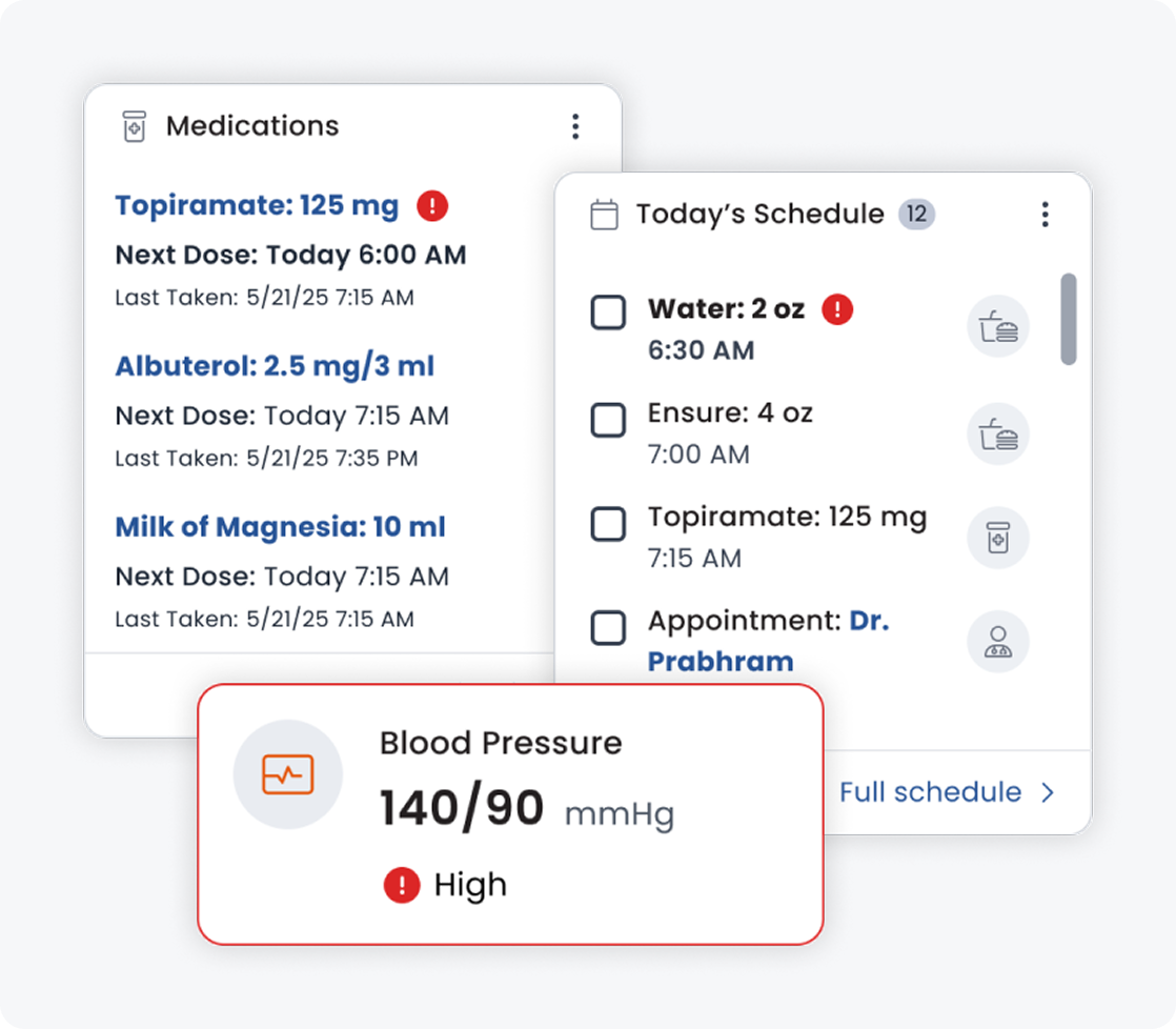
Missed medications and health changes are exactly what caregivers worry about, but too many notifications create noise and anxiety.
What we designed
Notifications that say what happened and what to do next, such as a high blood pressure reading or an upcoming dose, so important changes stand out without overwhelming anyone.
Outcome
A dashboard that lowers the load on caregivers
In one week we delivered a redesigned dashboard, a shared activity feed and an alert system. Together they help caregivers access up-to-date information, coordinate with each other and manage daily tasks, so they can make timely decisions with less stress and give their loved one more consistent care.
1 week
from audit and research to a redesigned dashboard
3
core caregiver problems addressed: visibility, coordination and alerts
1 hub
for health data, meds, schedules and care-team updates

 A team project at