Supplemental Health Care: a job application clinicians can finish
Redesigning a long, confusing application flow for a healthcare staffing company, so nurses and clinicians can apply in less time, with fewer errors and better data.
The front door to every placement was too hard to walk through
Supplemental Health Care places nurses and other clinicians in healthcare facilities. Every placement starts with the job application, and it had become long, confusing and full of unclear errors.
Candidates dropped off before finishing, which shrank the pool of qualified clinicians available to SHC’s clients. Our work focused on making the application feel short, clear and finishable on any device.
Challenge 1
Get people to the finish line
Raise completion with progress indicators, simpler tasks, helpful guidance and fewer unnecessary steps.
Challenge 2
Make it easy to find your way
Clear navigation, concise instructions and consistent patterns throughout the app.
Challenge 3
Ask for less typing
Cut manual data entry by auto-filling information from third-party sources and removing fields we didn’t need.
02 · Research
Three goals guided the research
Reduce the time it takes to complete an application
Real session recordings in FullStory uncovered pain points we might never have found otherwise.
03 · Key decisions
What we designed, and why
Decision 01
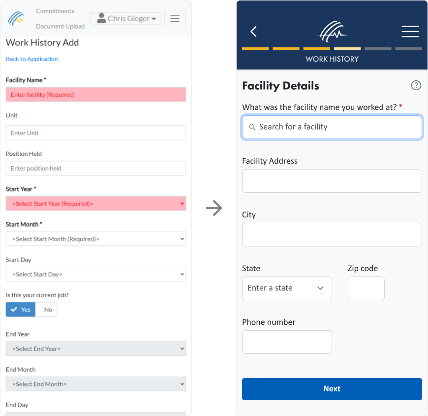
Break one long form into small, clear steps
What we found
A single long form felt endless and invited distraction and mistakes.
What we designed
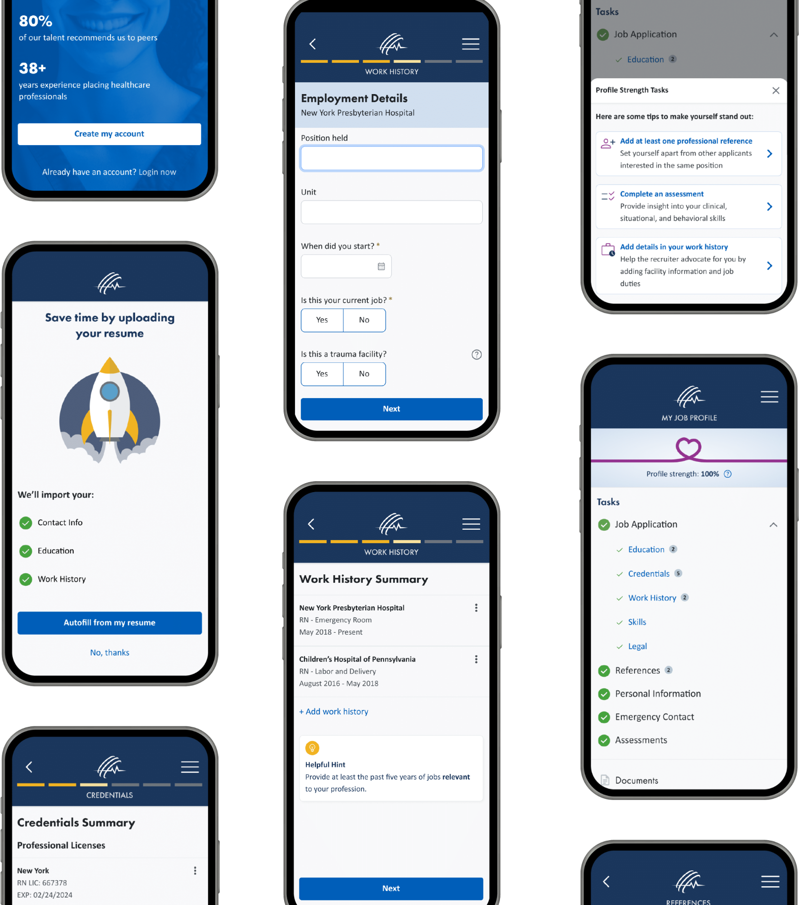
A linear flow that groups related questions into short steps. Each screen asks for one thing, which lowers cognitive load and makes progress visible.
Decision 02
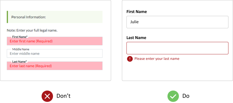
Error messages that tell you how to fix them
What we found
Vague messages shown in the wrong place left candidates unsure what was wrong or where.
What we designed
Less text on every screen, and specific error messages placed directly beneath the field that needs attention.
Decision 03
Let the résumé do the typing
What we found
Candidates were re-typing information that already existed in their résumé or other sources.
What we designed
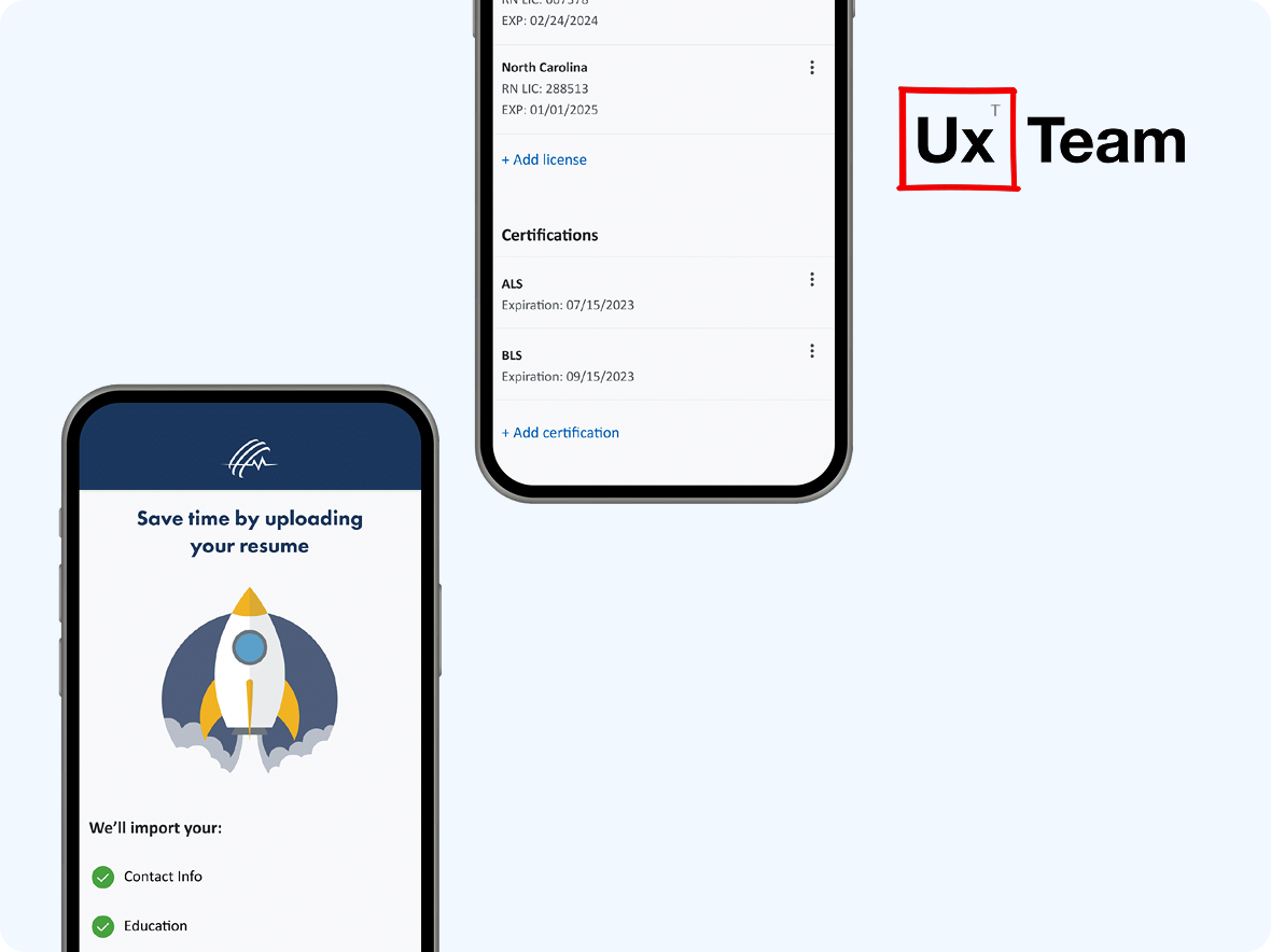
A résumé upload that pre-fills the application, plus a leaner form with unnecessary fields removed.
Decision 04
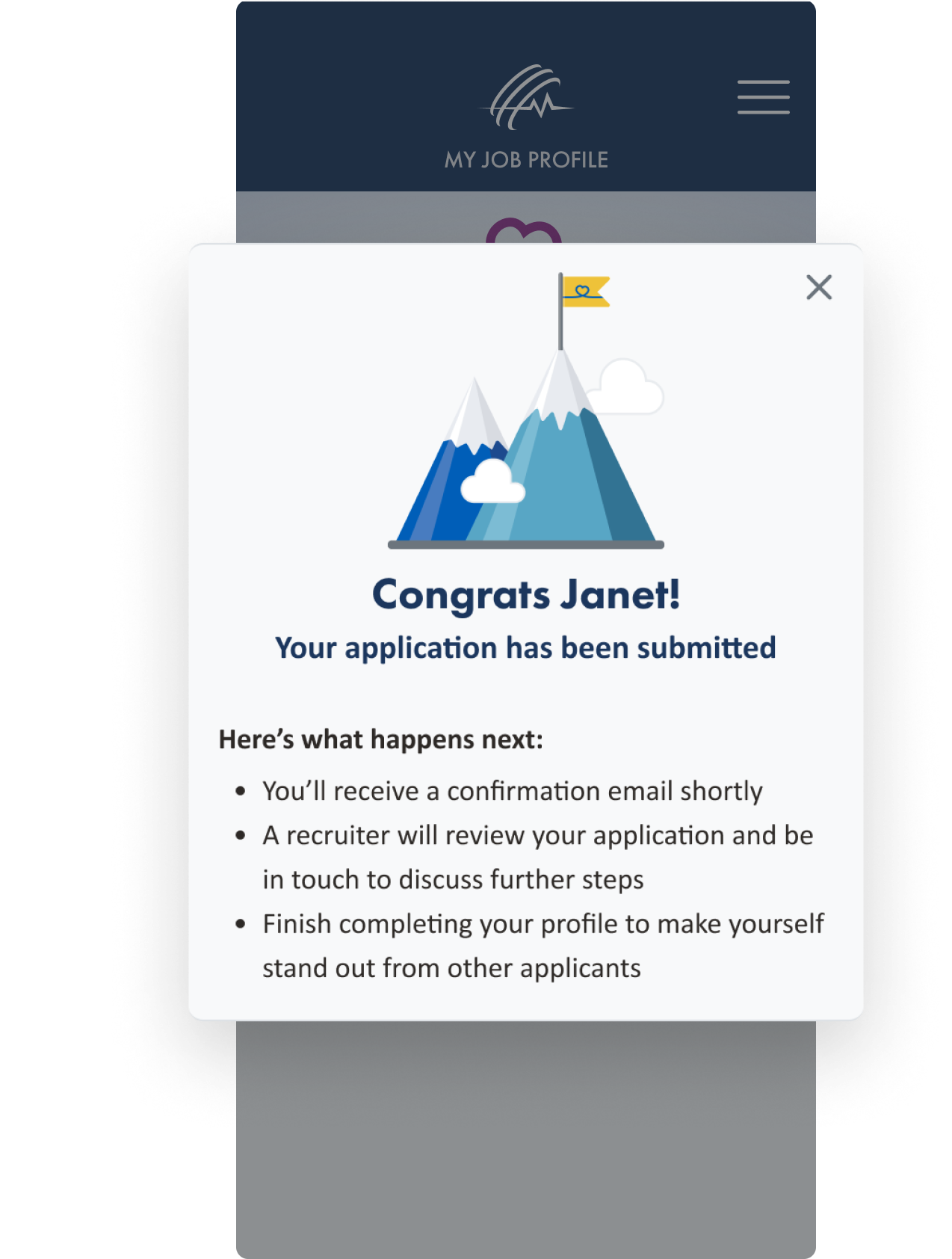
A clear "you're done" moment
What we found
After submitting, candidates had no sign they were finished, so many weren’t sure the application went through.
What we designed
A completion screen that congratulates the candidate and explains exactly what happens next.
04 · Delivery
Handoff built for developers
Once the flows were final, we prepared the handoff in Figma with annotated specs for spacing, type sizes and interaction behavior, so nothing was left to interpretation.
Components were organized into a Figma design system, which kept the web and mobile experiences consistent and made development faster.
Outcome
A shorter path from applicant to placement
The redesigned application gives candidates a clear, step-by-step path on web and mobile, with fewer fields, helpful errors and a clear finish. It was designed around SHC’s three goals: faster completion, fewer errors and better-quality data for the recruiting team.
7
research methods, from stakeholder workshops to card sorting
3
measurable goals: time, errors and data quality
2
platforms kept consistent through one design system

 A team project at